

It’s been a busy few months in the branding world – for the big guns and the little guys. There’s been rebrands for financial institutions, children’s TV icons, athleisure apparel, burger joints and everything in between. I’ve picked out three from the past few months that have really grabbed my attention. Let’s find out why.
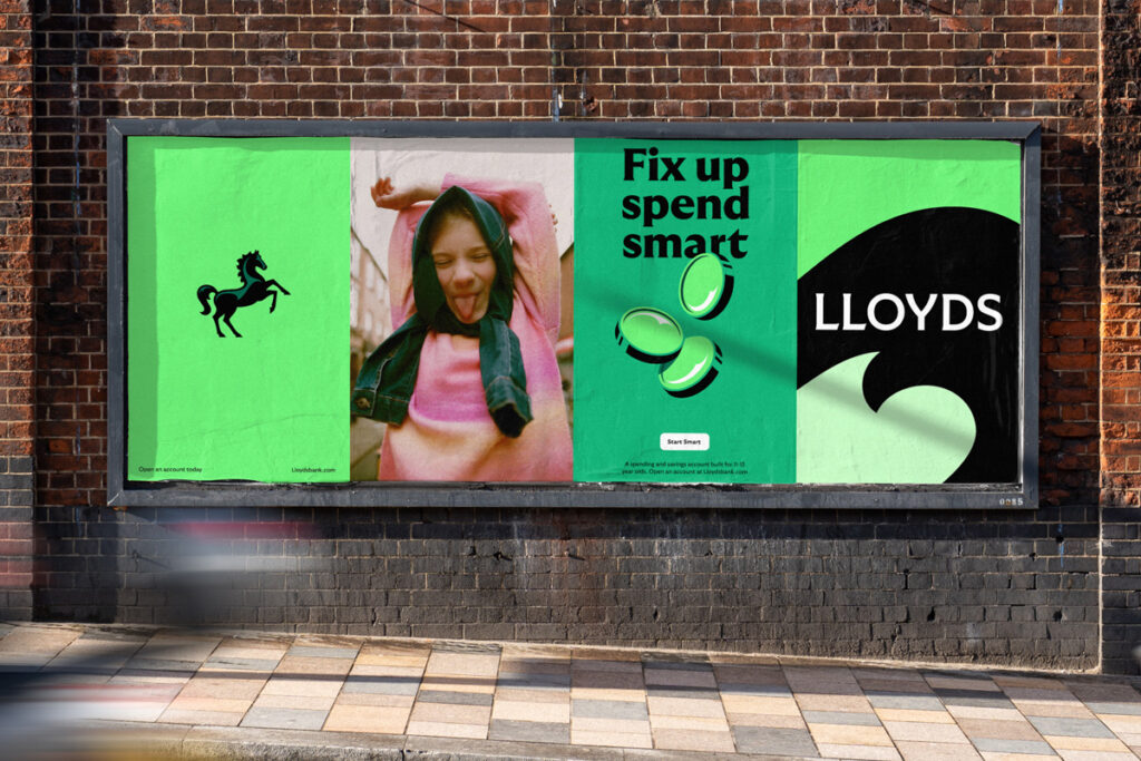
Lloyds Bank has been a staple on British highstreets for over 250 years, and with a current headcount of 30 million customers and 65,000 employees this rebrand was no mean feat. The challenge of dealing with these big brands that boast such strong foundations is striking the delicate balance of moving forward without leaving too much behind. It’s a hurdle that many creative agencies have stumbled upon, and never more so than in the current climate where branding looms large in the public mind.
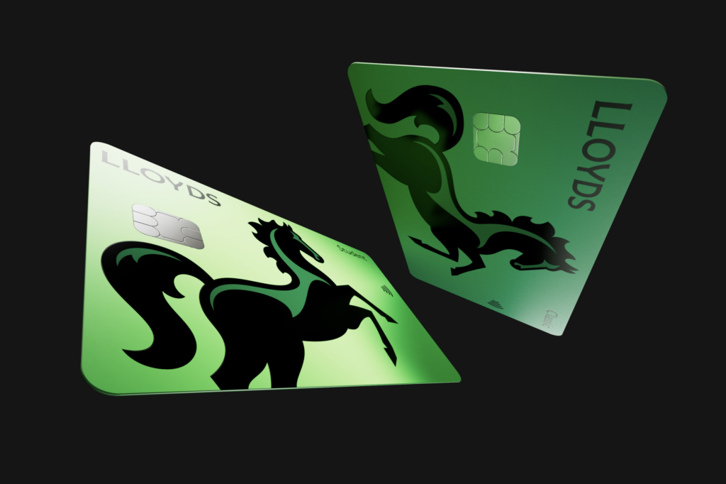
Wolff Olins are no strangers to this situation, regularly dealing with an enviable client list of some of the biggest brand names in the world. Perhaps unsurprisingly then, practice has paid off. This rebrand hits the mark across the board, demonstrating a confidence and finesse across a ridiculous range of touch points. The iconic black horse emblem has been redrawn from the ground up with some sleeker shapes, more angular details and, of course, he’s now looking in the right direction. The wordmark introduces some neat little serifs that mimic the shapes found in the aforementioned horse emblem. They’ve also brought our equine friend to life through a variety of slick animations. Logo animations are already tricky business…but animating a rearing and galloping horse… well, hats off.
Big banks are inherently uncool things. They’re boring, faceless corporations that exist because they always have. I wanted to not like this work, but there’s so much craft, consideration, time and effort that have gone into this you simply can’t knock it.
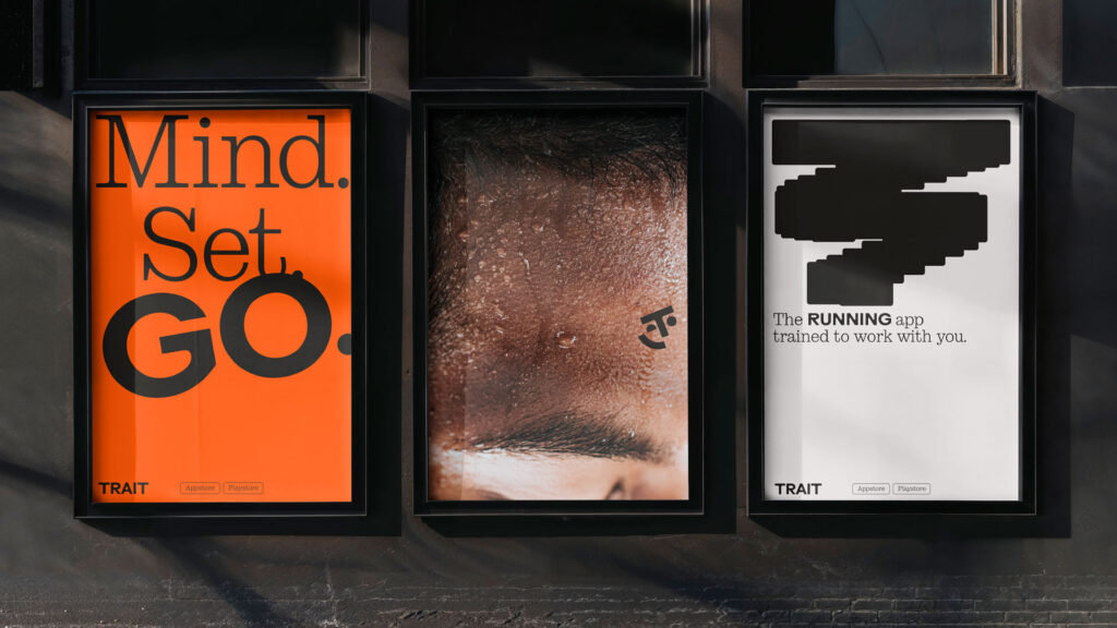
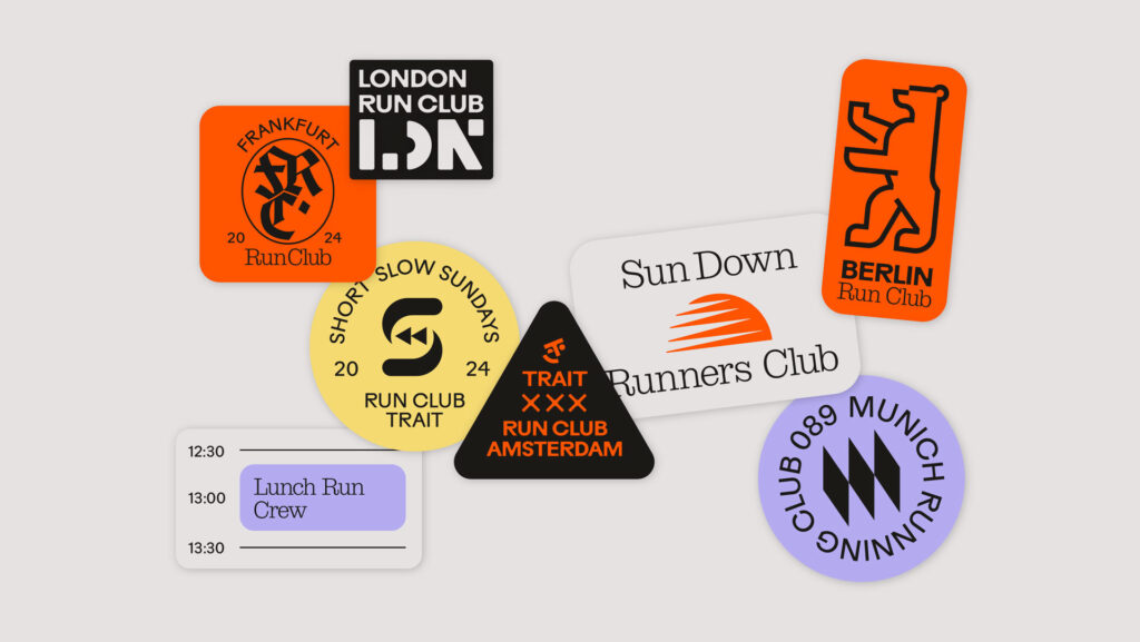
Trait is the latest running app to turn up for a lap around the block. It’s becoming a congested market with the big hitters proving a formidable force. Trait has a bunch of buzz-word-y things to make it stand out like ‘flexible training programs’, ‘sports science’ and ‘adaptable AI technology’, so on and so forth. What really caught my attention though, was just how good this brand looks.
First and foremost: the typography. It’s weird, wonderful and, at times, it’s wobbly. I absolutely love it. The colour palette is simple but works in perfect harmony; feeling active and sporty but intelligently remaining gender neutral. The photography has an art direction grounded in reality that’s casual, intimate and textural and is applied in such a way that works just as well full-bleed as it does cropped or layered.
It’s already a strong brand but Trait really hits its second wind with the motion that’s been woven throughout the identity. The logo does a happy little wink and nod, the type warps and drags across layouts and trailed patterns cut across designs. It shouldn’t work, but somehow it does.
The Munich-based outfit, Studio zur Strassen, have nailed this one. To distil it into a single sentence: Trait is something I want to interact with and be a part of. And what more could you possibly want from a fitness app?
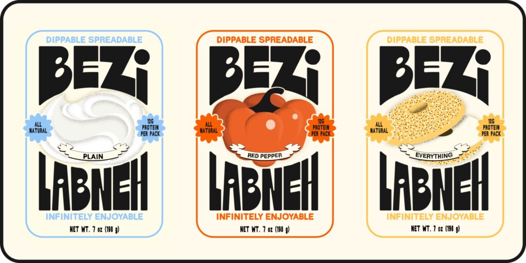
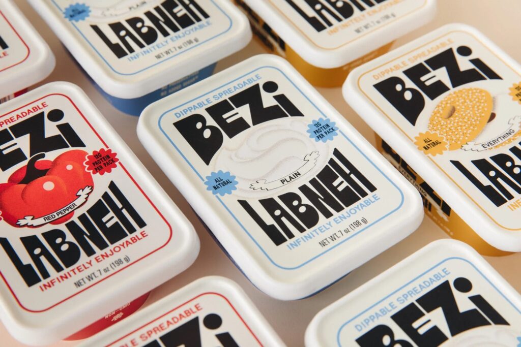
What is Bezi? It’s a new labneh dip. What is labneh? It’s a creamy yogurt cheese, popular in Middle Eastern cuisine. Now, admittedly ‘creamy yogurt cheese’ does not sound appetising, but just wait till you see the packaging.
Branding for food and drink holds an extra layer of complication – it has to work twice as hard because it has to sell you the taste of that product. I’ve never eaten labneh and I’m not that into cream, yogurt or cheese, but having seen Bezi, I’m currently Googling how to import one of every flavour.
There is something beautifully retro and charming about this brand. The big, characterful typography immediately grabs your attention. It’s loud without being annoying, and it’s guaranteed to stand out on the supermarket shelf. The colours, inspired by the three flavours (Plain, Red Pepper, and ‘Everything’ [intriguing]) are saturated and sunny, and look right at home among the typically colourful Middle Eastern spread. Perhaps the jewel in the Bezi crown is the illustration – three noisy, textural pieces across the corresponding flavours. In-keeping with the rest of the brand these illustrations are unique, playful and make me want to tuck right in.
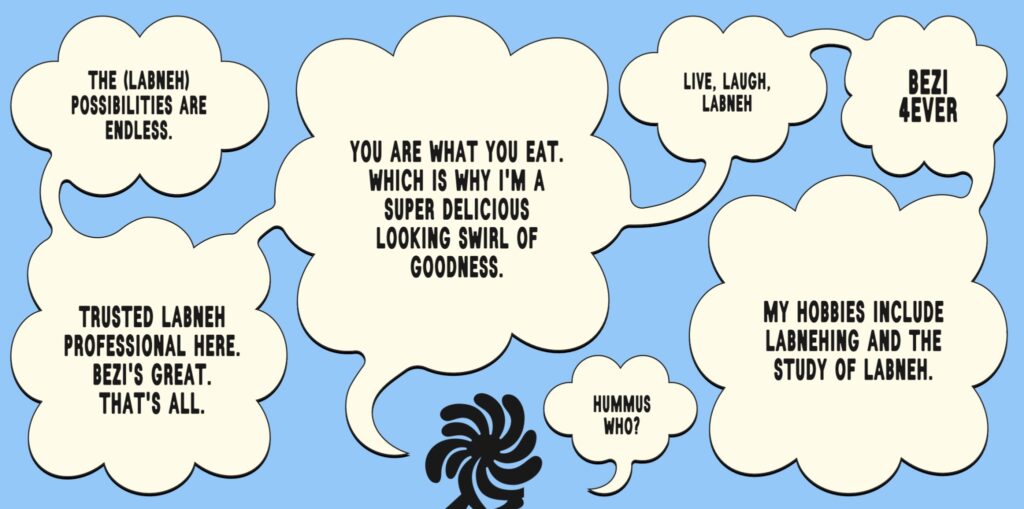
Questionable creamy yogurt cheese, anyone? Yes. Please.
So there you have it, three quick dips into three brands from the past three months. Each a little different from the last and all for the better. Now if you’ll excuse me I’m off to open a new account, go for a run, and have a delicious creamy snack.


