

In the world of brand identity, typography is often the unsung hero. Whilst brand logomarks, colour schemes and other design elements typically grab the spotlight, carefully crafted typography is a subtle, yet potent force that helps to shape how we perceive brands.
So firstly, what exactly is typography?
Typography in branding refers to the use of specific fonts, styles, and arrangements of text to create a distinct identity for a brand.
When used well, it becomes more than just a way to display words, it becomes a language of its own. In today’s blog we’re going to dive into why typography is so crucial to your identity and how it can speak volumes for your brand.
If you’d like to get your own stunning brand identity, complete with a typography to match, you can find out more about our Evolve brand sprints by getting in touch using [email protected]. Where we can discuss your current challenges and the ambitions for your brand.
Without any further ado, let’s get into the blog.
First Impressions
“You never get a second chance to make a first impression”, so the saying goes anyway. This definitely applies to all brand identities, and typography is central to this. The moment you see a logo or read a brand’s tagline, you’re subconsciously forming an opinion based on how it looks and feels.
Whether it’s the sleek minimalism of Apple’s typography or the playful, rounded letters of Google, that typography is speaking to you, telling you what kind of brand you’re dealing with.
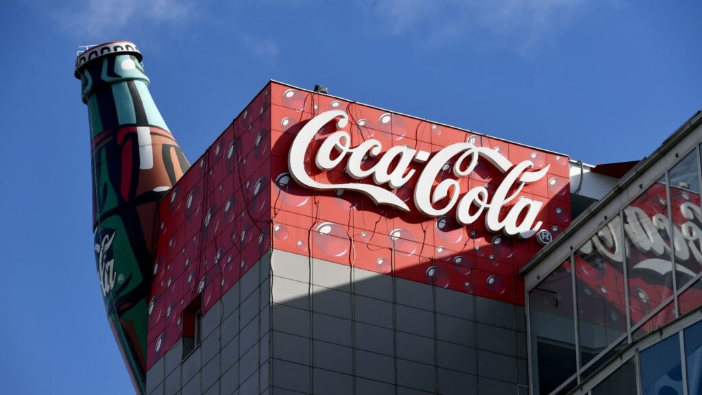
Take Coca-Cola, for example, whose script font is so iconic that even if you removed the brand name most people would still recognise it. That flowing, classic font instantly communicates the nostalgia and playfulness of the brand.
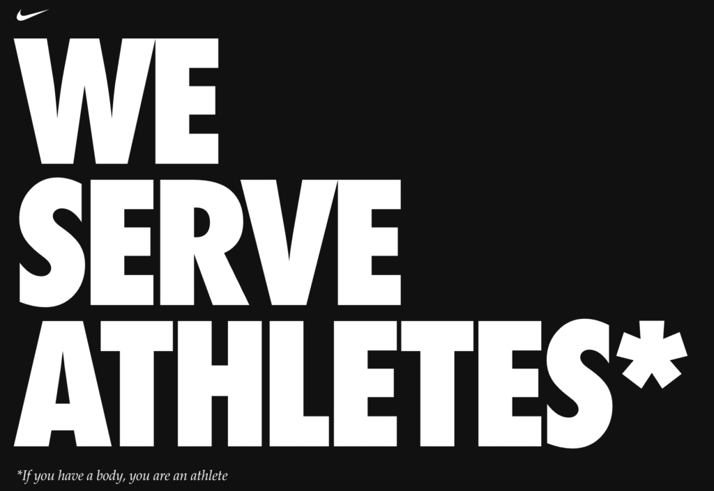
Contrast that with Nike’s bold, no-nonsense Futura font, which perfectly captures the brand’s ethos of performance and athleticism. The typeface used is direct, clean, and strong, reflecting the power and energy that Nike wants its customers to feel. Whilst by no means a unique font, Nike’s application has made it synonymous with the brand, with their clever use of italics also helping to drive home key messaging and convey the idea of motion.
The lesson here? Your choice of font directly shapes the perceptions of your brand and the positioning that you’re trying to achieve.
Typography Evokes Emotions
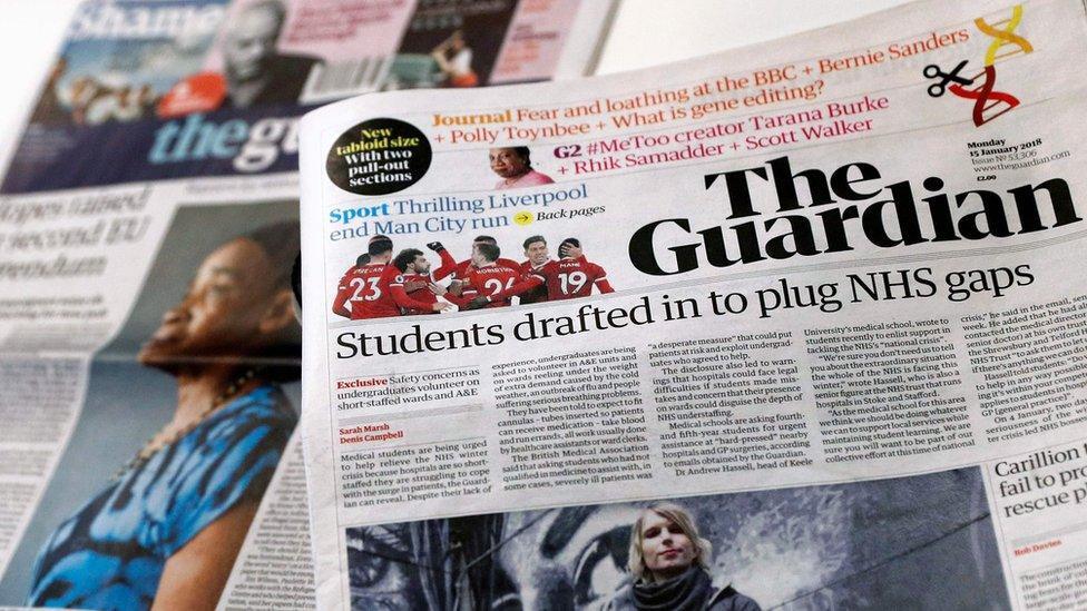
Typography can trigger feelings of excitement, calm, urgency and pretty much any feeling that the brand is trying to evoke. Think of Disney’s whimsical, curved typography that immediately transports you to a magical world of imagination and adventure, or The Guardian’s authoritative, serif font that oozes credibility and makes you feel assured by what they are about to say.
Imagine if Disney used a cold, angular font or if The Guardian decided to switch to Comic Sans. It would completely alter how you feel about these brands, beyond just your initial perceptions, it would feel incongruent as your emotions do not match up with what you are reading. Typography helps to further the brand’s personality and create a memorable, emotional experience that audiences can relate to.
Consistency Is Key
Now onto something that brands like Netflix have mastered, consistency. When it comes to brand identity, sticking to a well-chosen typeface across all platforms is crucial. Fonts, when consistently applied, help solidify a brand’s identity in the minds of consumers. Each time you see Netflix’s minimalistic, modern typography across its marketing, app interface, or even on an advertising board, it strengthens the brand’s association with innovation, entertainment, and simplicity.

Inconsistency, on the other hand, can dilute your brand’s impact. Imagine if every time you interacted with a brand, its font style changed, one day it’s a playful sans serif, the next a formal serif. It would confuse you, diminishing trust and any connection you had built up. Brands need to own their typography like a signature, ensuring that every touchpoint feels cohesive, from the website to packaging and everything in between.
Differentiation
In a world where attention spans are shorter than ever, typography can help you stand out from the crowd.
Everything about branding is to make your organisation more memorable whilst communicating who you are and your overall value, so don’t pass up the opportunity to convey your personality to your audiences through typography.
Be different, but not for the sake of being different, you’re simply expressing ways in which your brand is unique.
Conclusion
Typography is not a surface-level aesthetic choice, it’s a strategic and visual tool that shapes how audiences perceive your brand. Helping to further your overall brand positioning, whilst elevating your brand identity into something truly unique and memorable.
When applied consistently, your typography can help to build lasting, positive emotional connections that instantly evoke certain thoughts and feelings from everyone who interacts with them. Your typography represents how your brand speaks, feels, and engages with the world, so be sure to get it right.


