At Notepad, we live and breathe branding. Whether it’s building something completely new for our clients, or guiding brands through bold transformations, we know how much is at stake when a business decides to go through the rebranding process. Done right, a rebrand can sharpen your positioning, captivate your audiences, and truly become an unfair advantage over your competition. Done badly, and it can do the exact opposite. Confusing the people you care about, damaging your reputation, or worse, become a viral example of what not to do.
As a branding agency, we’ve seen the good, the great, and the truly questionable when it comes to rebrands (not from us we might add!). And whilst it’s easy to poke fun at failed logos and awkward name changes, each misstep offers valuable lessons in strategy, communication, and design.
In this blog, we’ll break down three high-profile branding misfires from the last few years, to explore where they went wrong, and what businesses of any size can take from their experience.If you’d like to find out more about our rebrand process, specifically the sprint version, have a read of this https://notepadstudio.com/our-evolve-branding-process/ , or alternatively, you can chat about your brand and future plans with our Client Services Director, Juliette Neault, via [email protected]
Right then, let’s get into these branding blunders.

Twitter to X: A rebrand that nobody asked for
In 2023, Elon Musk, never one to shy away from a headline, rebranded Twitter. Turning a platform with one of the most recognisable brands in digital history, to X. Yes, just X. A letter, a mystery, and a masterclass in how to throw away brand equity.
Twitter’s little blue bird wasn’t just a logo, it was a cultural symbol. “Tweet” was in the dictionary. The bird was the brand. Overnight, Musk stripped that identity, replacing it with an ambiguous black-and-white X and a vague promise of creating an “everything app.” No clear vision, no phased rollout, just… X.
The confusion wasn’t just external. Internally, the brand voice and purpose became muddled. Was X still about real-time news and social networking? Or was it now pay to play? Something about AI maybe? The answer seemed to change weekly. And users, advertisers, and the media noticed.
The impact? Users still call it Twitter. Posts are still “tweets” to most people. And in the minds of many, the rebrand was less a strategic pivot and more a billionaire’s vanity project. Musk even acknowledged he didn’t care about brand value, but that doesn’t stop it from being a case study in how not to manage a rebrand.
What can we learn?
Carry out a validation process: Assess what your audiences want and need, and how your ideas will connect with them.
Brand heritage is valuable: Don’t just discard what you have without a solid, well-communicated strategy.
Think about the practical applications: Sometimes even frontrunner concepts fall apart when stress tested with real world uses, you’ve got to consider every eventuality.

WeightWatchers to WW: A Diet of confusion
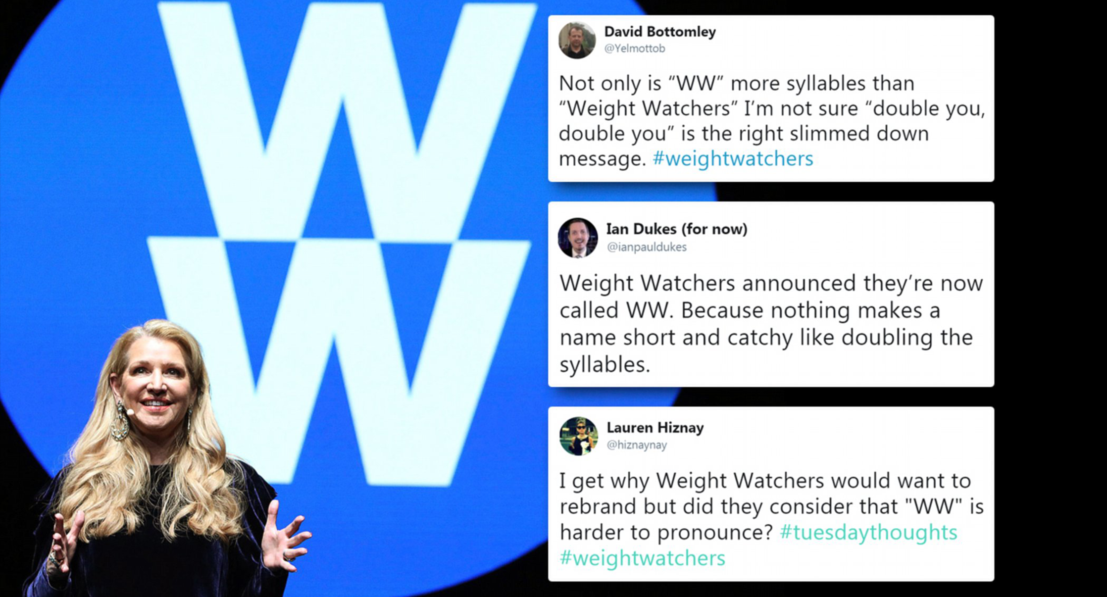
In 2018, WeightWatchers, the household name synonymous with calorie counting and weight loss support, decided that it was time to evolve. They dropped their classic name and rebranded to WW, accompanied by the slogan “Wellness that Works.”
On paper perhaps, the strategy made sense. Society was shifting away from “weight loss” and embracing “wellness”, a broader, more holistic concept. But here’s the issue, beyond the surface WW didn’t seem to actually change much. The app, the programme, the points system were all still heavily rooted in dieting, not wellness. The brand had pivoted in name only.
Even worse, the name WW didn’t stick, no one called it WW. New members were confused, existing customers clung to the familiar WeightWatchers identity. And those outside the brand simply didn’t know what WW stood for. Worldwide Web? Wonder Woman? A new wrestling federation? The acronym was nowhere near distinct or ownable enough. And, ironically, WW is a bit of a mouthful.
Financially, the rebrand didn’t help either. Membership numbers declined and stock prices wobbled, all while wellness-savvy competitors like Noom captured the market with sharper, clearer messaging. It was announced in May 2025 that WeightWatchers have filed for bankruptcy, maybe not entirely down to the rebrand but it is certainly a result of their lack of strategic direction that a solid brand helps to provide.
What can we learn?
Rebrands should be backed by action: Usually rebrands are sparked by an evolution that an organisation has already experienced / is experiencing. But if you promise something new, then audiences need to see evidence for it.
Names matter: If your new brand name confuses audiences or simply doesn’t resonate, you’ve already lost them.
Don’t abandon brand equity for trends: WeightWatchers had decades of recognition. The better approach? Evolve the perception, don’t erase the name.

Leeds United: A crest that lasted about six hours
Apologies if you aren’t a football fan, but this is a classic example that you can laugh at and learn from regardless.
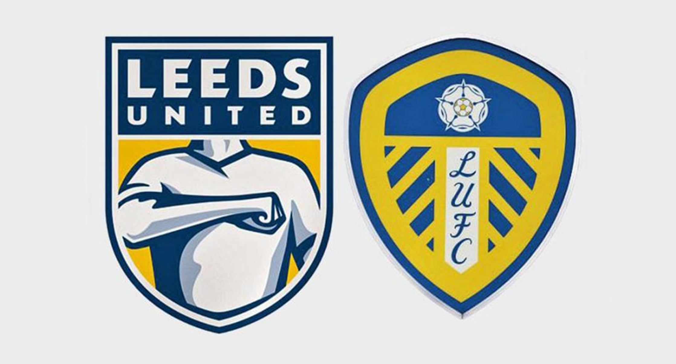
In 2018, Leeds United Football Club, one of the most storied teams in England decided it was time for a fresh look. To mark their centenary, they unveiled a brand new club crest. The problem? It looked like a clip-art knockoff from Pro Evolution Soccer in 2002.
Gone was the iconic white rose of Yorkshire and the club’s traditional shield design. In its place, a cartoonish logo featuring a simplified figure clutching its chest in what was supposed to represent the “Leeds Salute”, a gesture familiar to the Elland Road faithful, but utterly lost in translation when rendered in badge form.
The backlash was instant, brutal, and relentless. Social media lit up with disbelief, memes, and parodies. Within hours, over 77,000 fans signed a petition demanding the club abandon the design. It wasn’t just about aesthetics, fans felt the new logo stripped away heritage and reduced the club’s identity to a generic, faceless figure.
To Leeds’ credit, they listened and acted fast. By the end of the day, the club issued a statement saying they’d “re-open the consultation process” and soon shelved the design entirely. Instead, they eventually opted for a more traditional crest that resonated with the club’s legacy.
What can we learn?
Consult your core audience first: Leeds had claimed to consult “10,000 people” but the reaction suggested otherwise, or that those insights were ignored.
Heritage matters, especially in sports: Audiences don’t want their history erased for the sake of looking ‘modern’.
Sense Check: If your new logo looks like it belongs on a supermarket football, it probably needs a rethink.
Final Thoughts


