When SuperTech first approached Notepad to help create their new brand in late 2020, they were a nameless group of ambitious people from the professional services tech sector, looking to make a telling difference in the West Midlands. Since then the brand had grown rapidly, become established on a regional level and developed an even clearer sense of what they wanted to achieve.
With a proven track record and evolved service offering, the time was right to develop an updated brand strategy, identity and website which translated all that SuperTech has to offer.
The Strategy
As an emerging organisation who were bringing together stakeholders from different sectors and industries, the central themes of the 2020 strategy were promoting greater collaboration, highlighting the cluster’s potential and growing an ecosystem around its companies.
In the time since launch, SuperTech had emerged as true leaders of this ecosystem, holding the keys to the region and acting as a driving force in supporting change for organisations.
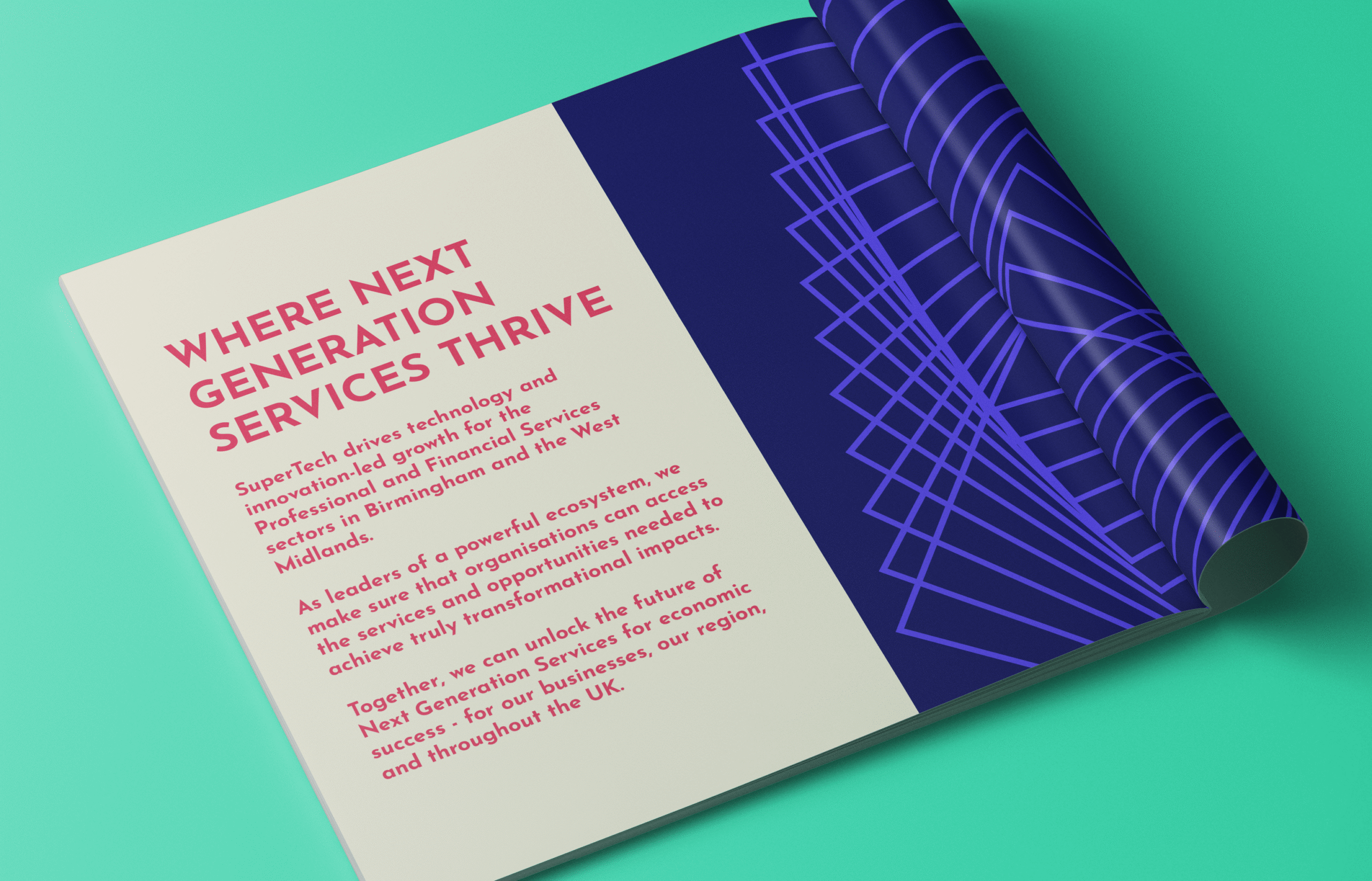
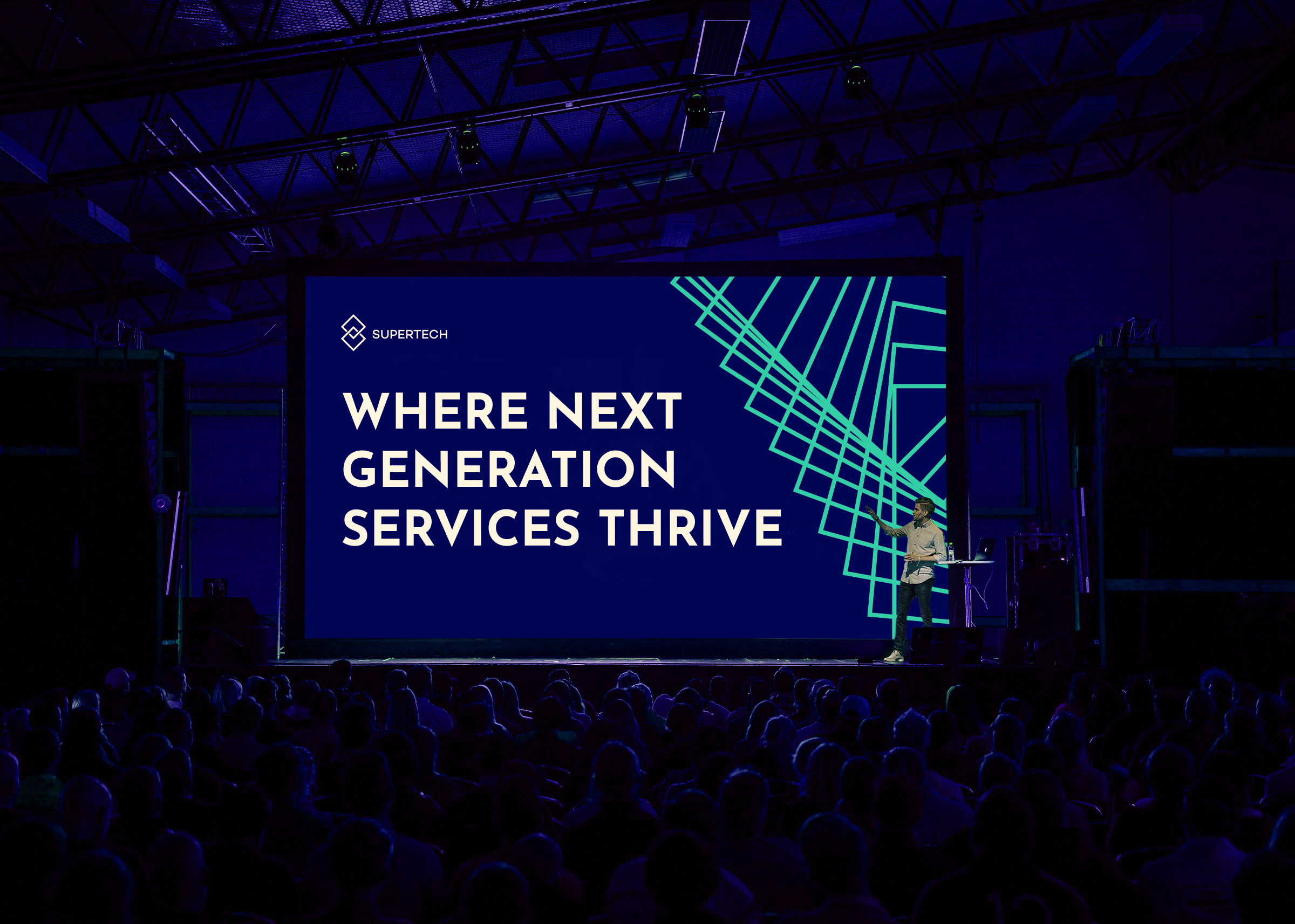
We wanted the refreshed brand strategy to project confidence, further SuperTech’s position and speak about the real impacts that they help ProfTech companies and innovative startups to experience.
SuperTech are not just asking for people to believe in the region, they are working hands on with organisations to deliver services and opportunities that accelerate change. This action-led approach would be communicated throughout the strategy.
The Brand Identity
SuperTech’s updated identity reflects a mature but energetic brand, one that is serious about impact, but never afraid to push what’s possible.
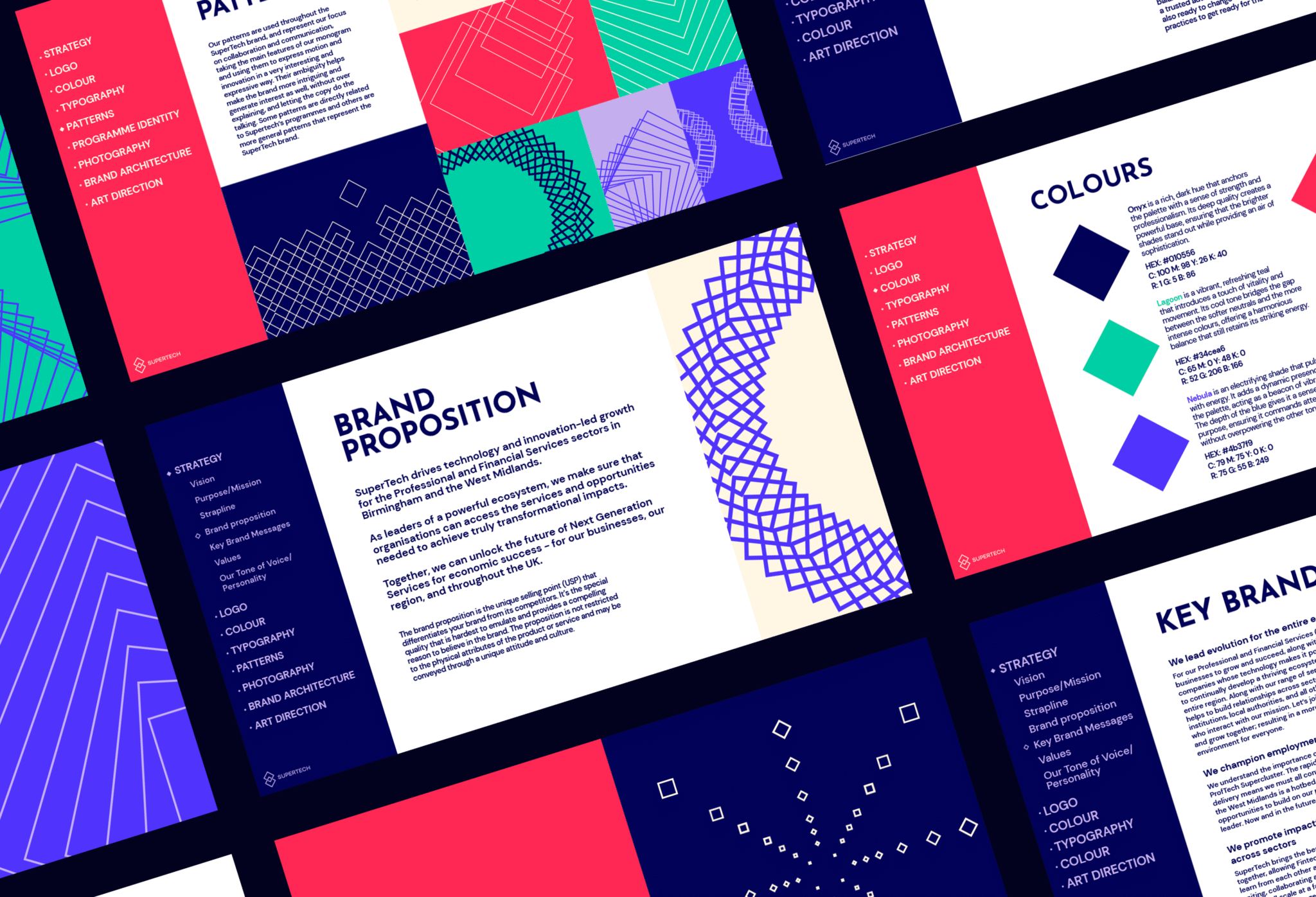
To bring the strategy to life visually, we reimagined the SuperTech identity to reflect their evolved position as confident, credible leaders. During the Brand Workshop we highlighted the personality traits of Professional Rebels: bold enough to challenge convention, but deeply grounded in real-world outcomes. At home in both boardrooms and with innovative startups.
The refreshed identity introduces:
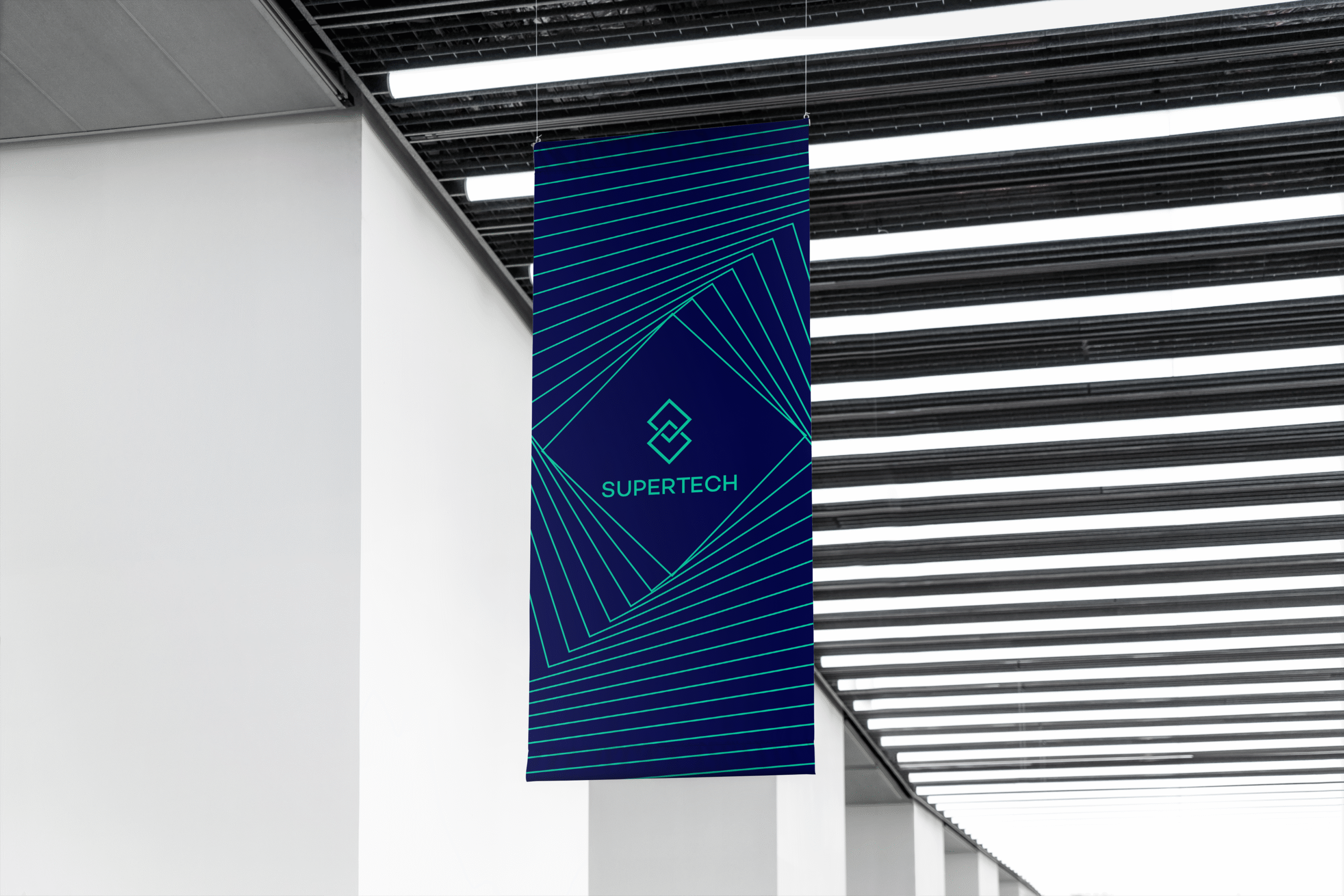
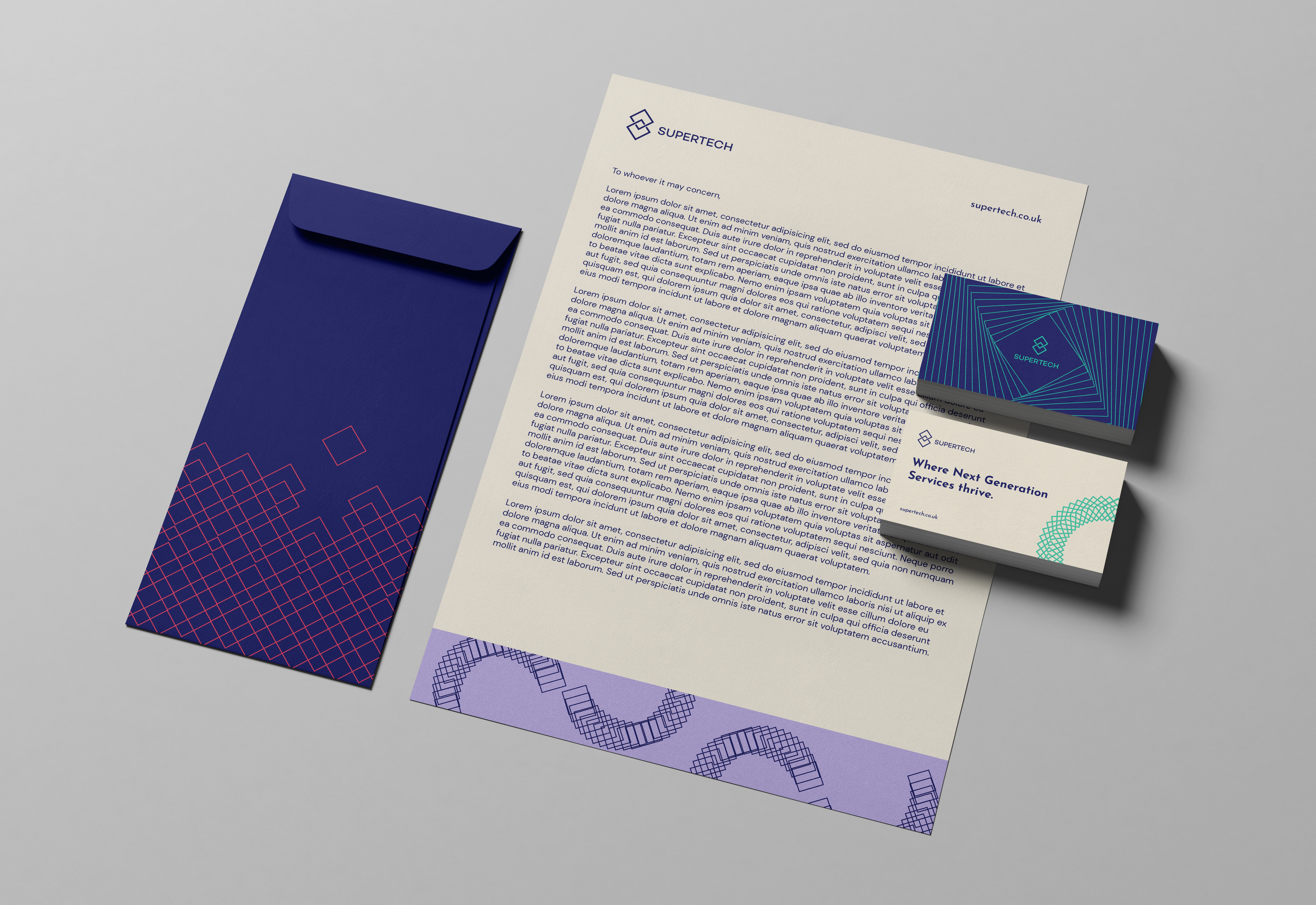
A refined visual system: With a clearer sense of who they are and what was needed, we streamlined the previous branding into a cleaner system that SuperTech could apply across their platforms.
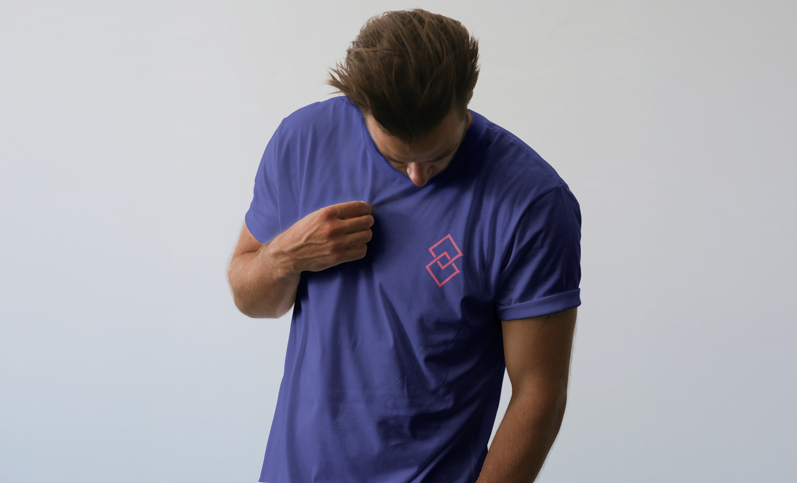
A new icon set: Custom-built icons were designed to reflect the dynamic sectors SuperTech connects, as well as the services they offer.
A bolder colour palette: Stronger, more vibrant hues represent SuperTech’s confidence, paired with darker grounding tones for balance and professionalism.
Typographic clarity: A modern, accessible type system enhanced legibility while enabling more expressive storytelling.
Rollout
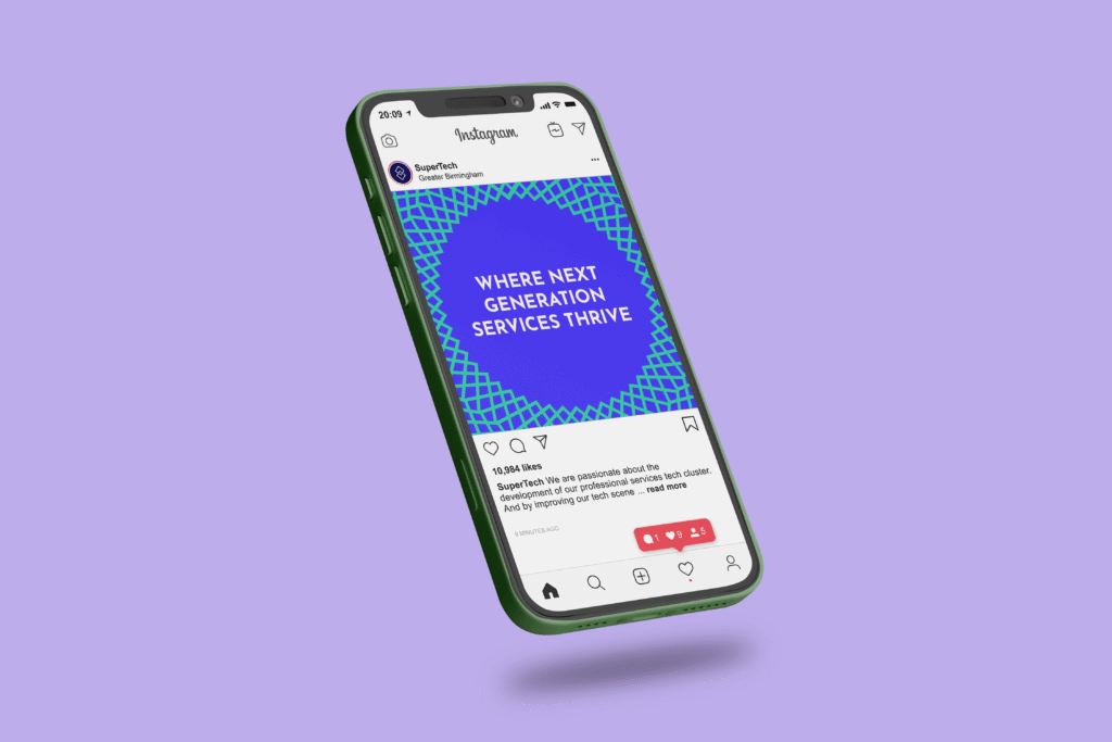
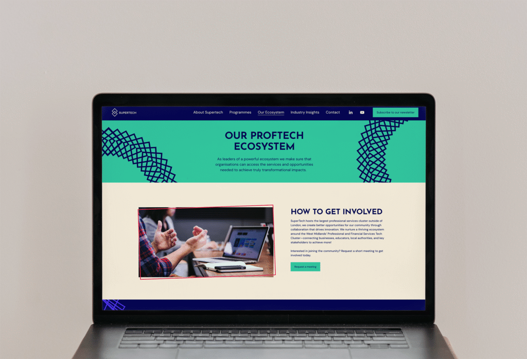
As the primary touchpoint for the brand, the website needed to do more than just show off the updated strategy and identity, it had to function as a live hub for SuperTech’s community.
In collaboration with the SuperTech team, we designed a new site map and layout that clearly organises and communicates their offering.
Acting as a signpost for all the goings on within the ecosystem and allowing audiences to find what’s right for them. Whilst engaging everyone who visits through compelling visuals and messaging.
“We partnered with Notepad to shape our initial brand, and working with the team again to refresh and realign our brand has strengthened clarity and our current position within our ecosystem. Through a robust strategic framework, they helped us develop our brand to reflect the impact we’ve made to date, and also positioned us powerfully for the future.
The whole team delivered with creativity and expert insight. Always responsive, guided by a strong strategic vision, and aligned to clear project timelines and deliverables, the team made the entire process seamless. On top of that, they were an absolute pleasure to work with.”


