When Total Distribution Limited, as they were previously known, approached Notepad for a brand sprint project, it was done with some clear outcomes in mind. Their existing brand strategy and identity was to be reimagined into something truly memorable within the space, and this would work in perfect harmony with a newly developed, much needed brand name.
Total Distribution were previously providers of IT hardware to local businesses, physically delivering the products to clients. However, as the service offering evolved into providing unrivalled consultancy and IT solutions, the need for change was obvious.
The Strategy
After a highly informative brand workshop session and validation stage, it was clear that the new brand name, positioning and overall strategy should reflect an all-round, supportive service, as well as an innovative, forward-thinking approach.
After much exploration we landed on the name Kaika Tech. Kaika can mean both flourishing or blossoming in Japanese, and also the action of guiding someone in a positive direction and building their understanding. These are all ideas which tie in perfectly with the Kaika Tech’s service offering, values and positioning.
As is evident in the new Kaika Tech brand proposition we developed.
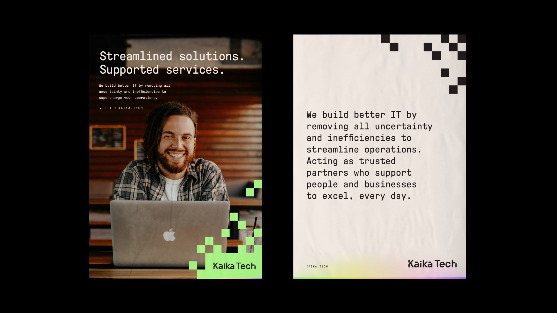
“Kaika Tech are passionate about helping businesses to reach their full potential by empowering your people and streamlining the way your organisation uses technology.
Through our expertise and unwavering support, we revolutionise organisations and drive their operational efficiency, bringing your ambitions closer to reality.”
This, along with the entirety of the brand strategy, establishes Kaika Tech’s core strengths and expertise whilst making them feel more human and engaging than the competition, helping to convey the team’s caring personalities and tireless work ethic.
0
Week Brand Sprint
0
Happy Clients
0+
Assets Created
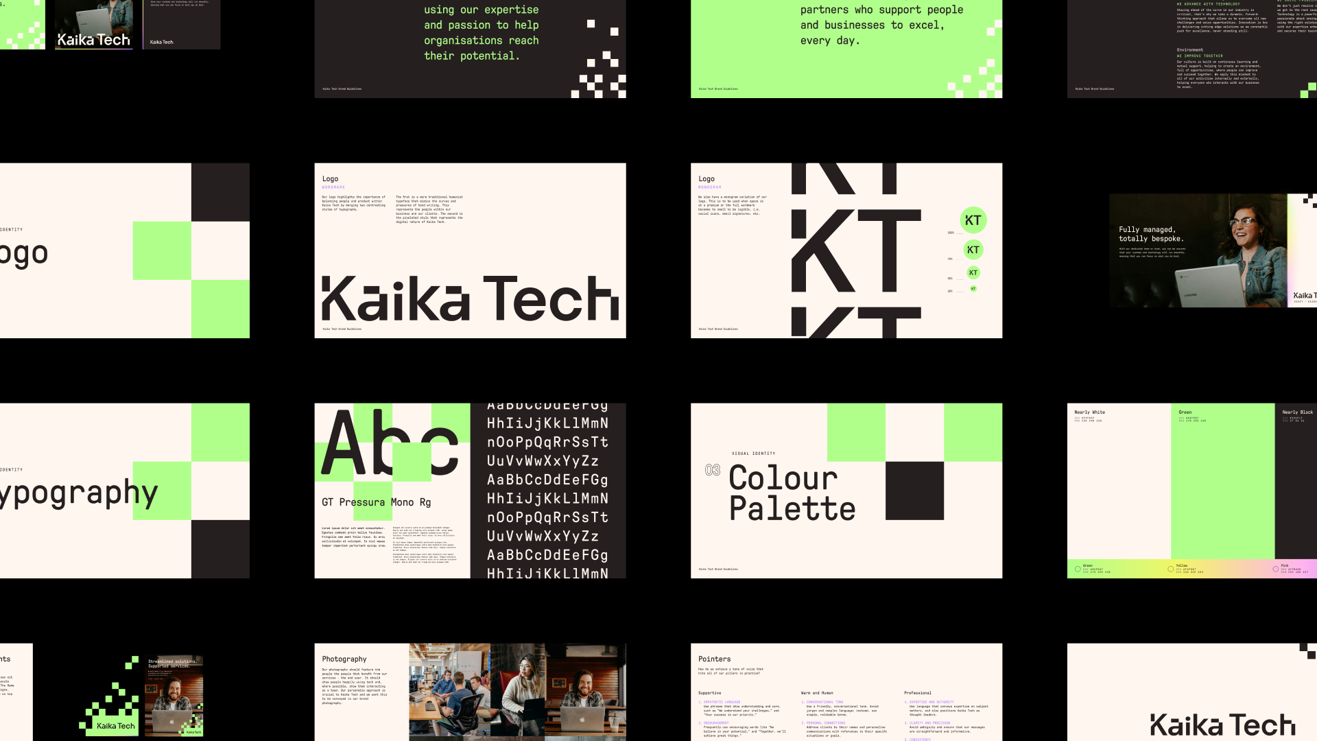
The Identity
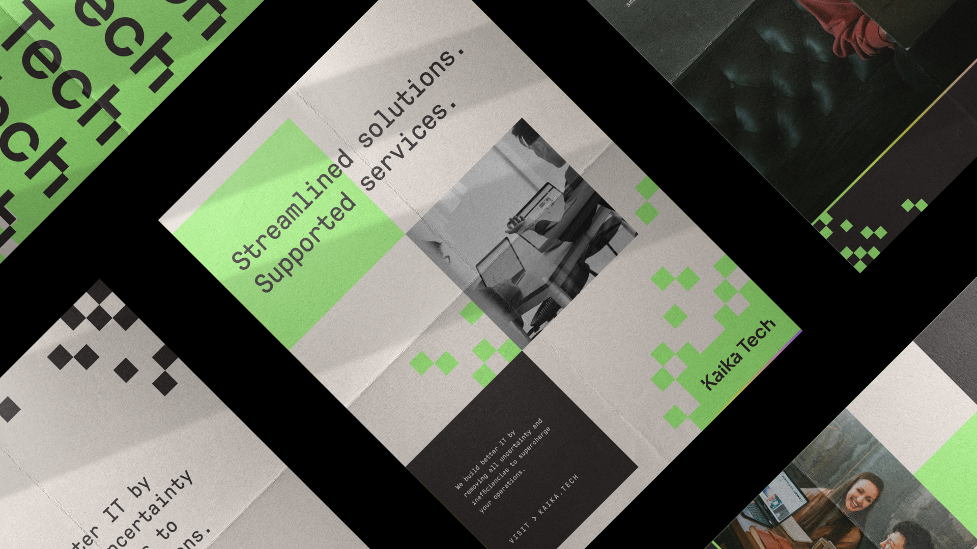
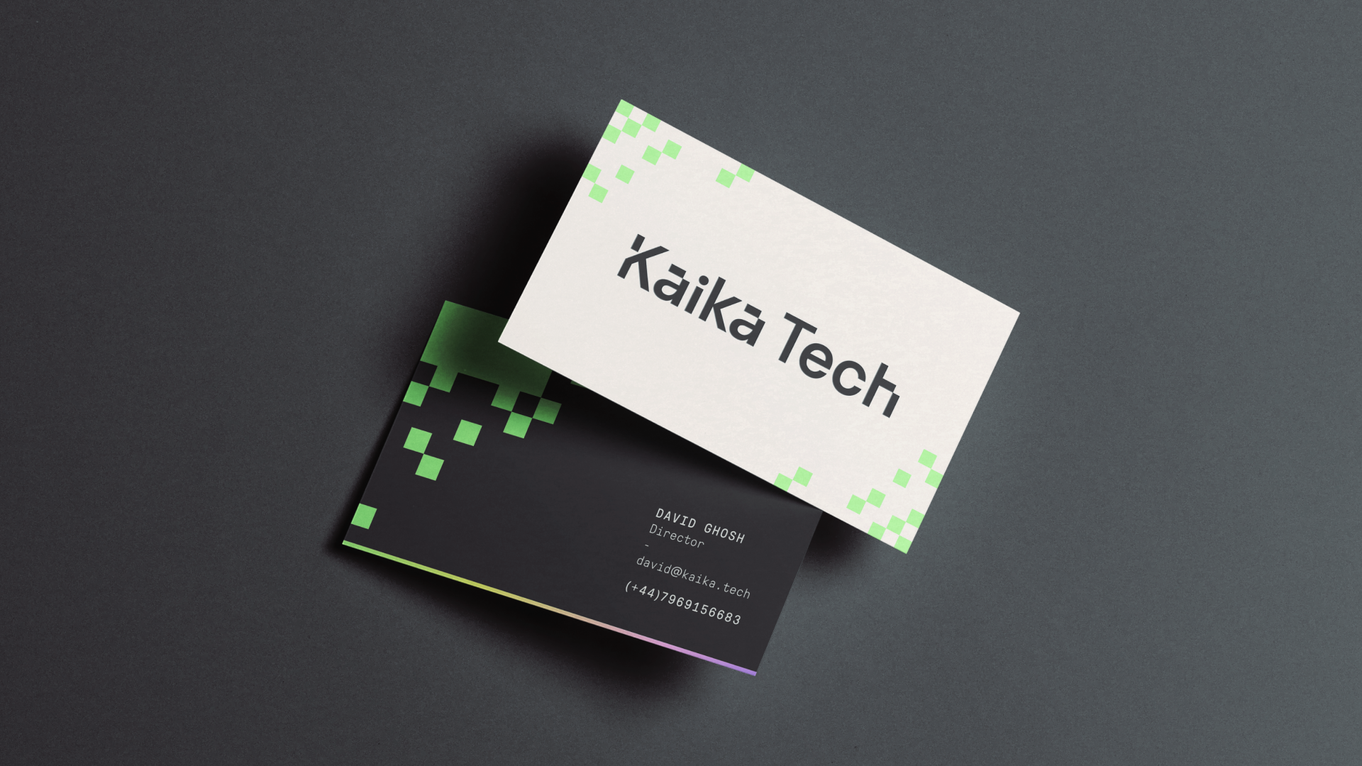
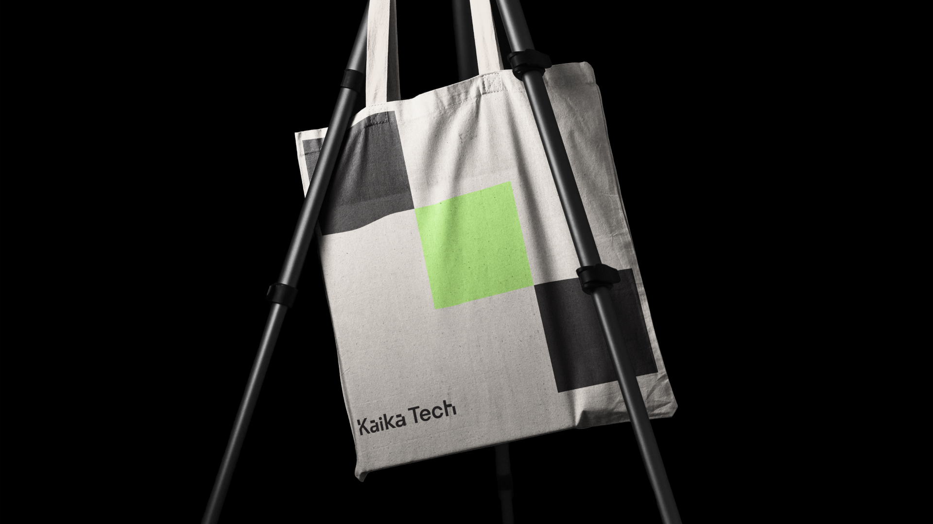
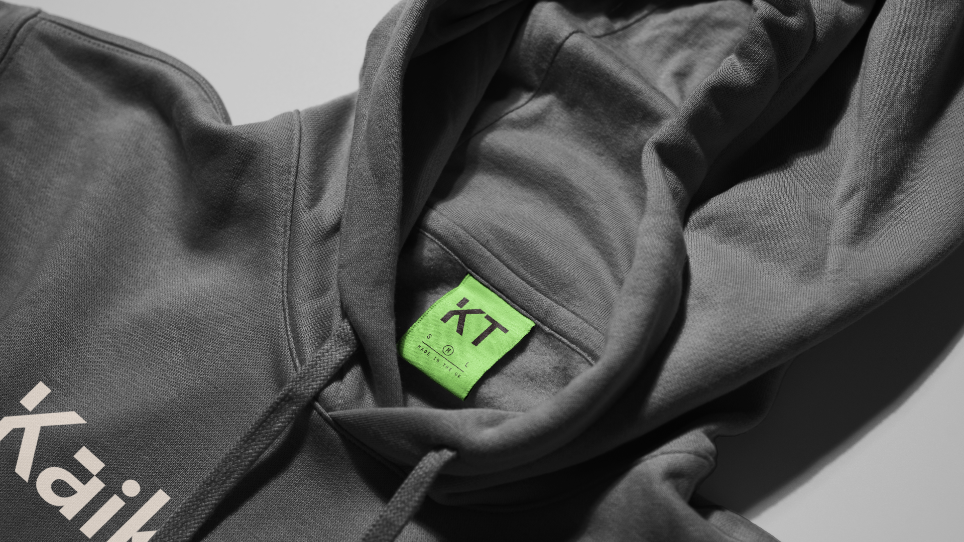
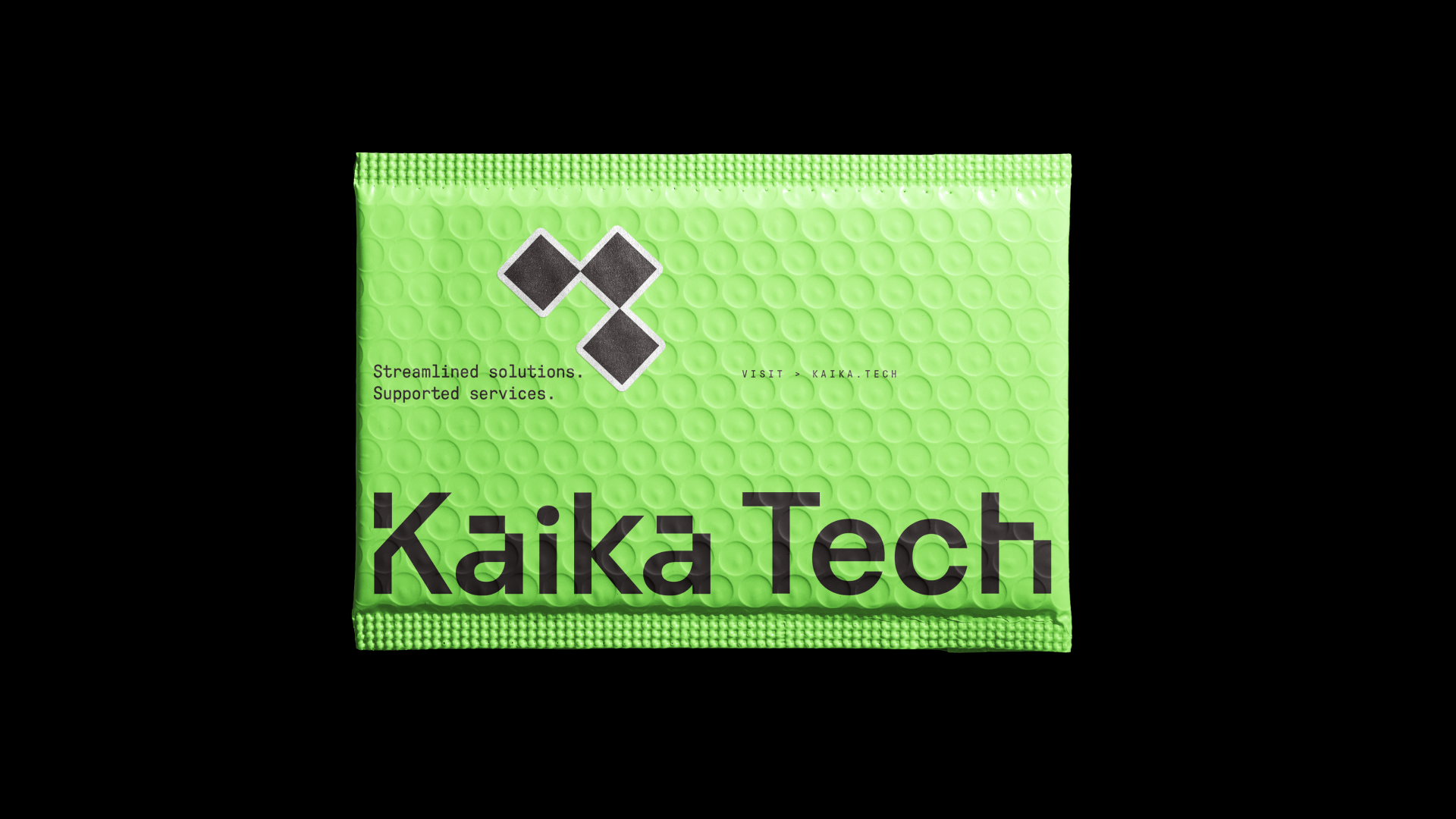
Building upon the brand strategy, Kaika Tech’s new logo highlights the importance of balancing people and product by merging two contrasting styles of typography.
The first is a more traditional humanist typeface that mimics the curves and pressures of handwriting. This represents the people within the business and clients. The second is the pixelated style that represents the digital nature of Kaika Tech.
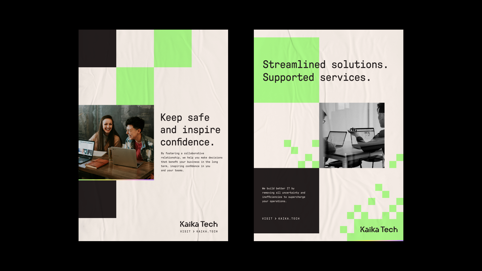
The rationale is creatively executed across all graphic elements used in the brand and also extended into our choice of photography. Feeling authentic and warm whilst celebrating Kaika Tech’s people-focussed approach, which ultimately benefits the end-users of the service to drive business success.
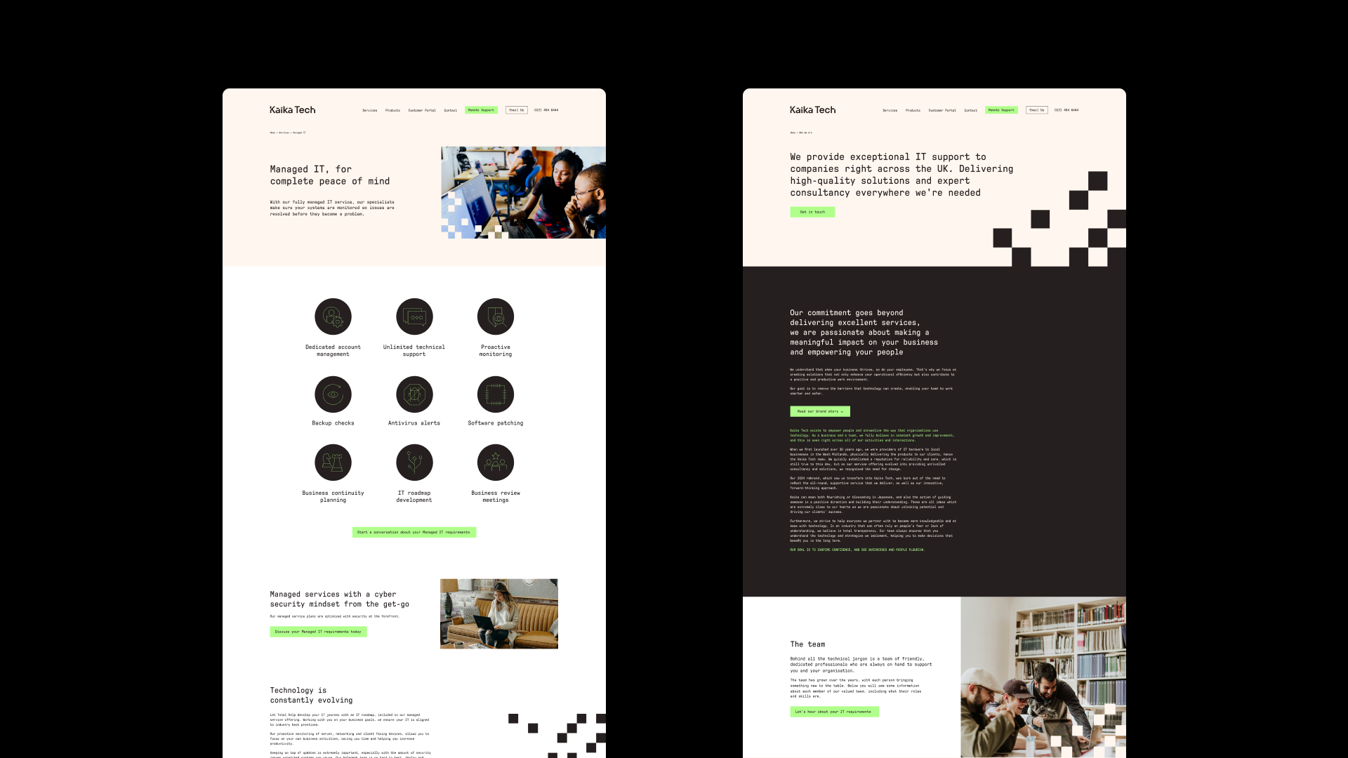
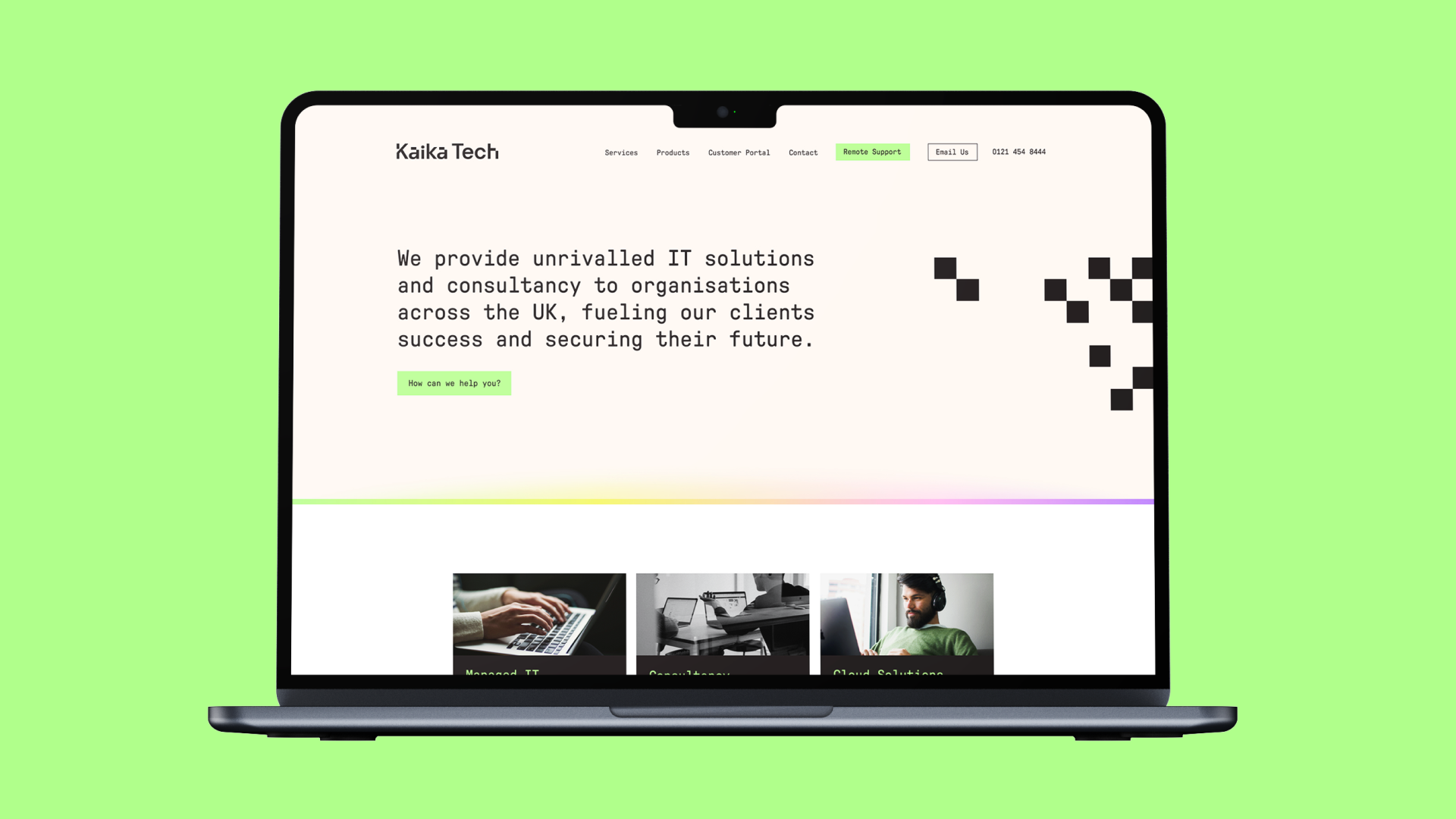
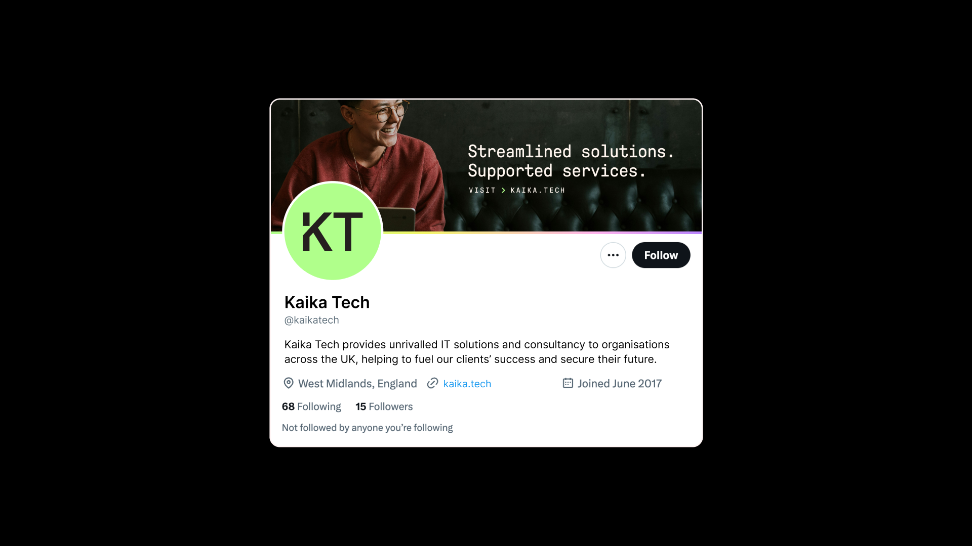
The Website
Although no longer part of the brand sprint process, this doesn’t mean that the pace slowed at all. We efficiently redesigned Kaika Tech’s website, which would bring the stunning new brand identity to life in front of their audience’s eyes. We also supported on rollout comms which would guide all existing clients, explaining the rebrand and drum up excitement.
“Notepad have been instrumental in not only the design and delivery of the Kaika Tech look and feel, but more importantly showed us what a brand should represent.
When we purchased Total Distribution Ltd nearly 5 years ago, I had a clear idea of how a technical service company should operate, but didn’t know how to position our internal values externally for the world to see, and to emphasise the human connections we make with our clients.
The team at Notepad quickly understood our culture and designed a brand around it. From the guidelines to help build our brand, to revisions and tweaks, to accommodating all sorts of questions about next steps for us, we couldn’t be happier with Kaika Tech’s look and the expert guidance that Notepad have provided.
We highly recommend Naeem, Ju, Dom and the rest of the team. Branding is an art, and it has been a pleasure to Notepad with us on our journey.”


