For over a decade, Buyapowa has led the way in refer-a-friend marketing, empowering influential enterprise brands to grow and succeed. Their all-in-one, fully automated reward platform has revolutionised sales and lead generation. As Buyapowa’s service offering evolved, their leadership team recognized the need for a brand transformation to mirror their ambitions and solidify their position as a leading marketing technology partner. Notepad’s challenge was clear: create a brilliant brand strategy and identity to encapsulate their growth ambitions and unmatched expertise.

To reflect their growing service offering, we created a strategy to provide clarity and generate excitement among external audiences. The main goal was to make the platform easier to explain their 8 different solutions, effortlessly sell, and capture Buyapowa’s audience’s attention. Our team created a powerful tagline that took centre stage: “The all-in-one fully automated reward platform for enterprise marketers,” setting Buyapowa apart from their competitors.
Creating a consistent tone of voice was crucial for Buyapowa to maintain a strong presence in their highly competitive industry. Every word and message had to resonate with their core values and inspire unwavering trust with their clients. With a clever balance of confidence and authenticity, their communication style became synonymous with industry leadership, instilling confidence and trust in their marketing endeavours.
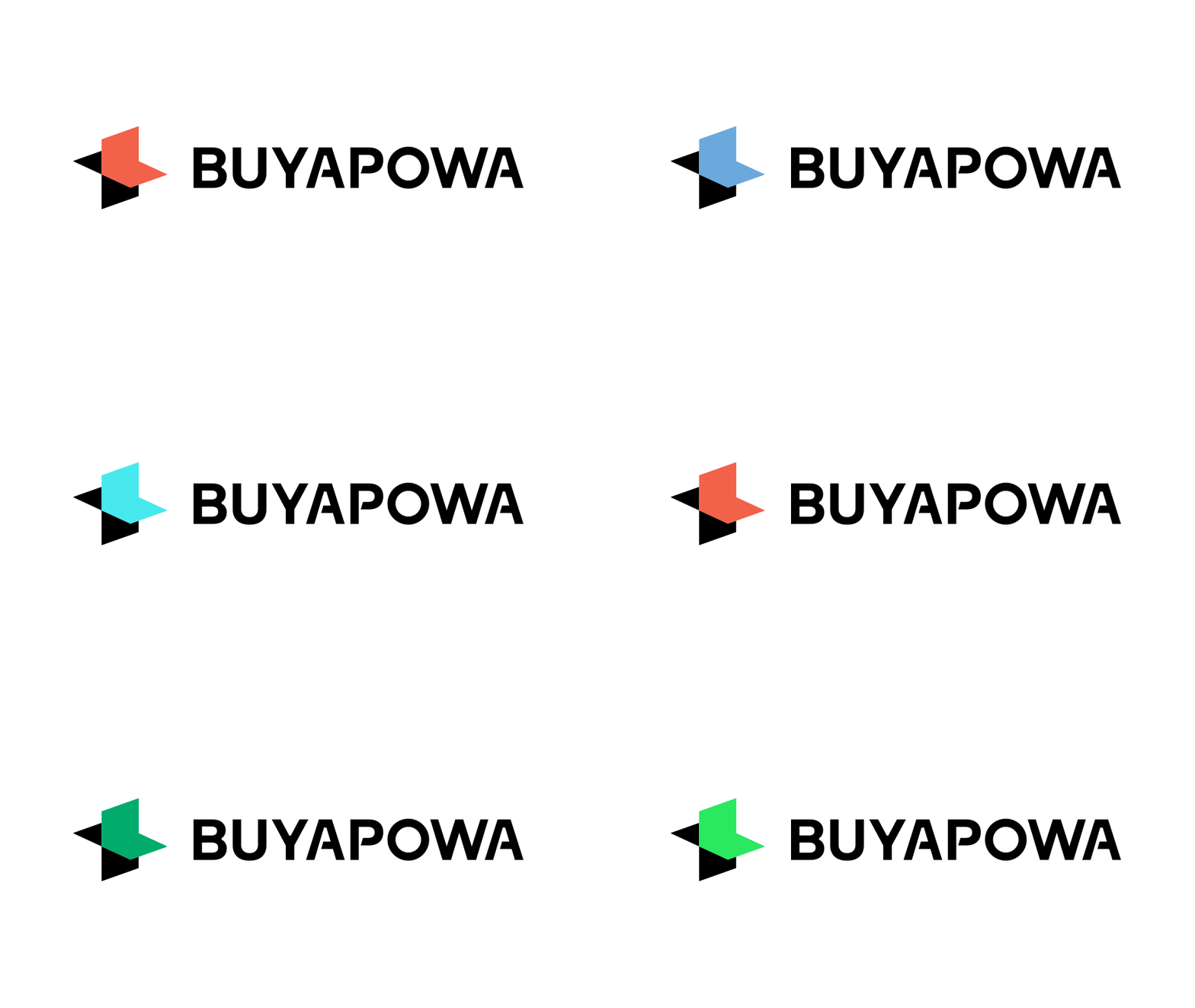
With a robust strategy in place, our team embarked on crafting a captivating brand identity to engage Buyapowa’s audiences. A carefully curated colour palette communicated their expertise and exuberance, featuring a range of hues. Contrasting colours were chosen for legibility and impact, while blues and greens, were elevated by vibrant highlight colours, infusing the brand with plenty of energy and excitement.
Inspired by dotted grids and their fluid transitions, our team created a suite of patterns that became the essence of Buyapowa’s referral process. These patterns symbolize growth, depth, and communication, with each dot representing a milestone achieved and a connection made. The logo, featuring the “+” symbol, evokes the spirit of addition, reflecting Buyapowa’s commitment to helping brands and showcasing the transformative impact they bring to every partnership.
This brand transformation has propelled Buyapowa to new heights, solidifying their position as a leading marketing technology partner. And set them apart and positioned them for future growth.

Gideon Lask
CEO, Buyapowa