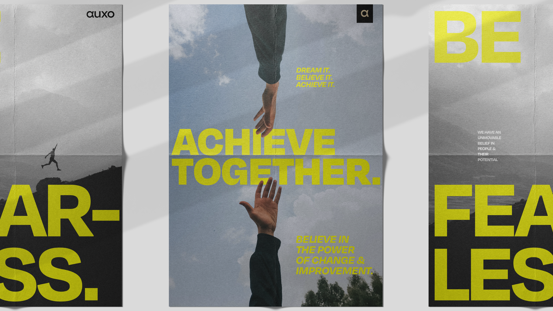
The Auxo Group are a forward-thinking group of businesses that provide people-focused services such as recruitment, consultancy and project-based solutions across a diverse range of specialist industries.
With ambitious plans in place to grow from 350 to 1000+ staff (largely through acquisition), the group brand was in need of a clear direction and strategy to align their portfolio of existing brands, as well as all new brands which would join the group in the future.

The existing brand architecture posed several challenges thanks to the rapid expansion of the group. The number of different sectors underneath the master brand had already grown to 6, as the structure was too narrow to accommodate certain acquired companies.
Notepad did not want a situation where this number would continue to rise, diluting the brand and reducing clarity even further.
Some brands within the group had high degrees of equity in their markets whilst others had none. Furthermore, the architecture was a somewhat muddled hybrid of a branded house and a house of brands. So yes, plenty of work to be done!
After extensive exploration the decision was made to change the name to Auxo Group, after Auxo the Greek Goddess for growth and increase, not only reflecting the expansion of the organisation, but also their strong “growth mindset”.
Brand architecture was a central part of our decision-making, informing all brand strategy and identity work which would follow, as we had to view it through a highly practical lens, always considering how brands would sit next to each other and how acquired brands would be integrated into the group.
To inform this process, we engaged with business leaders, team members and clients across the entire portfolio to better understand their relationship with the group brand and how they would benefit from updated brand architecture.
From here, Notepad developed an endorsed brand architecture model with renamed and 3 consolidated sector groupings. Infrastructure, Innovation and Community. This was the ideal solution to the challenges presented as it would maximise the equity of acquired brands, with strong reputations in their respective markets, whilst improving collaboration and the strength of the master brand. Helping brands within the groupings to find common ground and become more efficient to manage and market, whilst allowing for seamless acquisitions.
After crafting a clear proposition and messaging focusing on this growth mindset, talent and the transformative impacts the group delivers, we created a brand identity to bring it all to life.
The visual identity took inspiration from nature, representing growth and connectivity, as well as subtle nods to the Ancient Greek heritage of the brand name. As seen across the new logo, typography and colour palette.
Photography was also crucial in achieving our desired positioning, using it to reflect Auxo’s people-focused core whilst showcasing industry and diversity. Photography would feel warm, natural, aspirational, creating a sense that the viewer is looking into the subject’s world.
As part of the art direction, we also implemented a grid system to introduce more colour and visual intrigue in the layouts, whilst also communicating the ideas of structure, elevation and progress. This all came together in a truly unique, stunning brand identity which helped to give tangible meaning to all of the strategy and architecture work which had proceeded.
